Why industrial dashboards look polished but miss action
Publication Date
author
Industrial dashboards often impress with sleek industrial iot dashboard visualization, yet fail where decisions matter most: action. For teams evaluating warehouse management system wms integration, mes integration with sap erp, or a scada system integrator, polished screens without engineering depth create costly blind spots. This article examines why attractive interfaces can hide weak operational logic—and what data-driven leaders should demand instead.
Across manufacturing, warehousing, aerospace-adjacent operations, robotics, and precision machining, dashboards are frequently treated as the final proof of digital maturity. A plant manager sees color-coded OEE tiles, a procurement director sees throughput charts, and a CTO sees cloud-connected equipment data. Yet when a late shipment, servo fault, or quality drift appears, the same dashboard often cannot answer the next 3 operational questions: what changed, why it changed, and what action should be taken within the next 15 minutes.
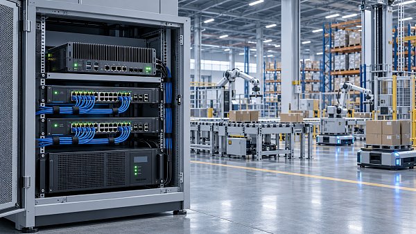
That gap matters because modern industrial systems are no longer isolated. A warehouse management system, MES layer, ERP environment, edge gateway, machine vision station, and SCADA platform may all exchange data every 1–5 seconds. If the dashboard only summarizes output but does not preserve engineering context, the interface becomes a digital showroom rather than a control instrument.
For information researchers, operators, procurement teams, and enterprise decision-makers, the real question is not whether a dashboard looks modern. The real question is whether it shortens diagnosis time, reduces supplier qualification risk, and supports parameter-based decisions. In line with TechStat Vanguard’s principle that parameters do not lie, the value of an industrial dashboard should be judged by operational truth, not graphic polish.
Why polished dashboards fail in real industrial environments

A visually attractive industrial dashboard usually succeeds at one thing: compression. It condenses hundreds of data points into a simple screen. The problem is that compression often removes the exact engineering detail needed for action. A green status light may indicate a machine is “running,” but it does not reveal whether cycle time has drifted by 7%, whether vibration exceeded a warning threshold twice in the last 8 hours, or whether a rejected batch originated from one tool path or an upstream material lot.
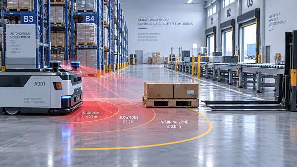
In warehouse operations, this failure appears when WMS dashboards show orders picked per hour but omit exception causality. If picking speed drops from 220 lines/hour to 165 lines/hour, the screen may still look clean. However, without slotting changes, device latency, labor path deviation, or AGV queue delay, supervisors cannot correct the issue before the shift loses another 2–3 hours of productivity.
In MES integration with SAP ERP, the same issue appears in a different form. Many dashboards report order completion, machine availability, and scrap percentages, yet they fail to link those metrics to routing logic, BOM changes, revision control, and actual operator interventions. When ERP and MES timestamps differ by even 30–90 seconds across systems, the dashboard may display a coherent story that is operationally false.
A SCADA system integrator can also deliver a polished human-machine interface that excels in alarm visualization but underperforms in alarm hierarchy, root-cause grouping, and escalation logic. Operators then face 40–80 alarms during a disturbance window, with no ranked sequence indicating which 3 alarms are causal and which 20 are merely downstream symptoms.
The four most common design mistakes
- Over-aggregation: hourly or daily averages hide second-level disruptions, micro-stoppages, and intermittent faults.
- Weak context: data points are displayed without recipe version, operator ID, material batch, tooling status, or environmental conditions.
- UI-first logic: visual consistency is prioritized over threshold engineering, escalation rules, and cross-system traceability.
- Reporting bias: the dashboard is designed for management review meetings, not for live intervention on the shop floor.
These weaknesses explain why some facilities invest 6–12 months in digital dashboards yet still rely on spreadsheets, phone calls, and manual whiteboards during critical events. The screen is present, but the decision path remains external. That is the exact sign that the dashboard has become decorative rather than operational.
What action-oriented dashboards should actually measure
An industrial dashboard should not begin with aesthetics. It should begin with action logic. For every metric on screen, there should be a linked decision: continue, inspect, isolate, adjust, escalate, or stop. If a KPI cannot trigger one of those actions within a defined response window such as 5 minutes, 30 minutes, or one shift, it is probably a reporting metric rather than a control metric.
The most useful dashboards combine 3 layers of information. First, they display live operational status such as machine state, queue length, takt deviation, and energy spikes. Second, they preserve engineering context including tolerance bands, recipe versions, sensor confidence levels, and maintenance history. Third, they provide intervention rules so the user knows what to do when a value crosses a limit.
In robotics and automation, this may mean showing not only robot uptime but repeatability drift, end-effector vacuum loss events per 1,000 cycles, and recovery time after safety stoppages. In edge AI systems, it may mean pairing image inference confidence with camera contamination rate, lens cleaning intervals, and reject verification workflow. In precision machining, it may mean connecting spindle load variation, tool wear trend, and Cpk movement within one view.
The table below contrasts decorative metrics with action-ready metrics used in practical decision environments.
The key difference is not more data for its own sake. It is better decision wiring. A dashboard becomes operational when every metric has a threshold, a timestamp, an owner, and a next step. Without those four elements, the system may look advanced but still fail at the exact moment production stability depends on it.
Three design principles for usable industrial visibility
1. Preserve raw engineering context
Operators and engineers need access to the source conditions behind the KPI. That includes tolerance windows such as ±0.02 mm, latency ranges such as under 100 ms, torque deviations, environmental humidity, and material lot traceability.
2. Rank decisions, not just events
A dashboard should distinguish between informational events, warning states, and stop-the-line events. A 3-tier or 4-tier escalation model is usually more useful than a flat alarm list because it directs limited human attention.
3. Connect every KPI to workflow
If the user has to leave the dashboard to search for work instructions, quality hold procedures, or maintenance approvals, action time expands. Good systems reduce the path from anomaly to instruction to closure.
Integration blind spots: WMS, MES, ERP, and SCADA are often misaligned
Most industrial dashboard failures are not visual failures. They are integration failures. The interface looks complete because each source system contributes data, but the underlying semantics are inconsistent. One platform treats a machine as “idle,” another marks it “ready,” and a third calls the same condition “available.” When status models differ across 4 systems, the dashboard can report precision while hiding ambiguity.
WMS integration problems commonly stem from transaction timing and location granularity. A dashboard may show stock available in real time, yet the underlying data is refreshed in 2-minute intervals while the floor executes in near-real time. In high-volume environments, a 120-second lag can misstate inventory at a critical picking face, especially when replenishment and outbound waves overlap.
MES integration with SAP ERP introduces a different risk. ERP often reflects planning truth, while MES reflects execution truth. If order release, material confirmation, and completion confirmation are not aligned at the event level, the dashboard becomes an averaging layer that smooths over real conflicts. That is particularly dangerous in regulated or tolerance-sensitive production where revision mismatch or lot substitution can trigger quality exposure.
SCADA environments add another layer of complexity because process signals may arrive at sub-second frequency, while management dashboards summarize them into 15-minute or hourly blocks. That translation can erase the short spikes that actually explain a compressor trip, a heat-treatment drift, or a servo protection event.
Key alignment checks before approving any dashboard project
Before evaluating screens, decision-makers should evaluate system definitions. The table below highlights common integration gaps and the operational consequence of ignoring them.
For procurement teams, this means vendor selection should include semantic mapping, event model design, and field-level traceability review. A dashboard provider that cannot clearly explain data lineage from PLC, edge device, MES transaction, or ERP object should not be judged on interface polish alone.
Minimum questions to ask a system integrator
- What is the refresh interval for each critical data source: 1 second, 10 seconds, 60 seconds, or event-driven?
- How are status codes normalized across WMS, MES, ERP, and SCADA layers?
- Can the dashboard trace a KPI back to original machine events, operator actions, and lot records?
- What happens when timestamps conflict or connectivity drops for 5–20 minutes?
- Which alerts are causal, which are derived, and how is that hierarchy maintained?
Those questions reveal whether the project is being engineered as a decision system or merely styled as a display system.
How buyers and operators should evaluate dashboard value before purchase
For buyers, the safest evaluation method is not to request more screenshots. It is to request use cases. A vendor should be able to demonstrate how the dashboard behaves during a line stoppage, a batch quality deviation, a warehouse congestion event, and a sensor communication loss. If all demonstrations use normal production conditions, then the system’s real value remains untested.
Operators should focus on cognitive load. During a disruption, can the screen be interpreted in under 10 seconds? Can a supervisor identify the top 1–3 priority actions without opening 5 more pages? Can a maintenance technician access trend data long enough to distinguish random noise from a progressive fault, such as the last 24 hours or the last 500 cycles?
Enterprise decision-makers should examine whether the dashboard reduces expensive uncertainty. In many industrial environments, the hidden cost is not only downtime. It is delayed qualification, repeated supplier audits, incorrect spare parts planning, and prolonged debugging cycles. A good dashboard can compress investigation time from days to hours if data lineage and intervention logic are built in.
The checklist below can support pre-purchase evaluation across manufacturing, logistics, automation, and hard-tech sourcing programs.
Practical buying criteria
- Traceability depth: can the KPI drill down to machine event, order number, operator action, and material lot within 2–4 clicks?
- Threshold logic: are warning and stop levels numerically defined, such as temperature above 85°C, latency above 150 ms, or scrap above 2.5%?
- Role relevance: do operators, planners, procurement leaders, and executives each receive action-appropriate views rather than one generic screen?
- Data survivability: does the system preserve context during outages, manual overrides, and synchronization failures?
- Implementation realism: can the dashboard be configured in phases over 4–12 weeks, or does it depend on a full digital overhaul before any value appears?
Red flags during vendor review
Be cautious if the proposal emphasizes animation, customizable themes, or executive overview pages while giving vague answers about OPC UA mapping, tag quality, event timestamps, master data governance, or exception handling. Be equally cautious if the supplier cannot explain how the dashboard helps reduce qualification cycles or troubleshooting loops in engineering terms.
This is where a data-driven benchmark mindset matters. In TSV’s worldview, a credible industrial interface should be judged the same way a precision component is judged: by tolerance, repeatability, failure handling, and traceable performance under stress—not by presentation quality alone.
A practical framework for building dashboards that drive action
The strongest dashboard programs usually follow a staged deployment model. They do not begin by asking, “What should the screen look like?” They begin by asking, “Which decisions are currently too slow, too inconsistent, or too dependent on tribal knowledge?” Once those decisions are identified, the screen becomes an instrument panel around real operating risks.
A useful framework has 5 steps. First, identify the top 10–20 operational decisions that affect throughput, quality, safety, or supplier reliability. Second, map the exact data sources and refresh rates needed for each decision. Third, define thresholds and escalation rules. Fourth, test the dashboard against abnormal scenarios. Fifth, review whether users took faster or better action after deployment.
This approach is especially important in hard-tech environments where engineering details determine commercial success. In robotics, UAV components, edge sensing, and precision machining, dashboards should not erase tolerances, confidence intervals, or failure modes. Those are not technical footnotes; they are the basis of procurement confidence and operational trust.
For organizations comparing suppliers, integrators, or internal digital projects, the goal is simple: demand interfaces that reduce ambiguity. A dashboard should clarify whether a tolerance breach is isolated or systemic, whether a downtime event is random or repeating, and whether a supplier’s performance is stable over 3 months or only attractive in a demo environment.
Five-step implementation path
- Define decision-critical scenarios such as unplanned stoppage, scrap spike, queue overflow, or parameter drift.
- Standardize data semantics across source systems before visual design starts.
- Set numerical thresholds, ownership rules, and response times for each alert type.
- Run a 2–6 week pilot with real production exceptions, not only nominal conditions.
- Measure outcomes: mean time to detect, mean time to diagnose, intervention accuracy, and recurring fault frequency.
FAQ: common selection questions
How long should dashboard implementation take?
For a focused pilot covering one line, one warehouse zone, or one process cell, 4–8 weeks is common if source data is accessible. Cross-functional deployments involving ERP, MES, SCADA, and quality systems often require 8–16 weeks because semantic alignment and test scenarios take longer than visualization design.
Which KPI is most often misleading?
OEE is frequently misread when availability, performance, and quality are shown without event granularity. A line can display acceptable daily OEE while still experiencing repeated 2–5 minute micro-stoppages that disrupt labor balance and delivery reliability.
What should procurement ask for in a proof of concept?
Ask for one abnormal event replay, one drill-down trace from summary KPI to source transaction, one alert workflow with clear ownership, and one demonstration of data behavior during sync delay or communication loss. Those 4 tests reveal more than a library of polished screenshots.
Who benefits most from action-ready dashboards?
Operators gain faster response guidance, engineers gain diagnostic context, procurement gains supplier and system transparency, and executives gain more trustworthy operational reporting. The value increases when all 4 groups work from the same event truth rather than separate reporting layers.
Industrial dashboards should be judged the way serious engineering teams judge any critical system: by precision, traceability, threshold logic, and performance under abnormal conditions. A polished industrial iot dashboard visualization can support communication, but it cannot replace operational truth. Whether you are reviewing warehouse management system wms integration, mes integration with sap erp, or a scada system integrator, the winning question is always the same: what action does this screen enable, for whom, and within what time window?
For organizations navigating noisy hard-tech markets, TechStat Vanguard’s data-first perspective offers a practical filter: demand measurable context, not marketing abstraction. If your team is comparing industrial data solutions, validating integration logic, or building a more decision-ready dashboard architecture, now is the time to get a tailored evaluation framework, review your operational use cases, and explore a solution grounded in engineering evidence. Contact us to discuss your requirements, request a custom assessment, or learn more about actionable industrial intelligence.
Search News
Hot Articles
- Carbon Fiber StructuresHow to Specify Aerospace Carbon Fiber Assemblies for Lightweight, Load-Bearing PartsJul 11, 2026
- Machine VisionXiaomi, Alibaba DAMO Academy Drive Open-Source Robotics Model Ecosystem, Lowering Algorithm Development Barriers for Overseas SMEs Adopting Chinese Robotics SolutionsMar 30, 2026
- Cobots & ArmsShanxi 'AI+' Conference Showcases Embodied Intelligence with Multinational Buyer Engagement: Key Industry ImplicationsMar 30, 2026
Popular Tags
Recommended News
 Jul 11, 2026How to Specify Aerospace Carbon Fiber Assemblies for Lightweight, Load-Bearing PartsAerospace carbon fiber assemblies: learn how to specify laminate design, load data, joining methods, and inspection controls for lighter, reliable load-bearing aerospace parts.Elena Rostova (UAV Systems Researcher)
 Mar 30, 2026Xiaomi, Alibaba DAMO Academy Drive Open-Source Robotics Model Ecosystem, Lowering Algorithm Development Barriers for Overseas SMEs Adopting Chinese Robotics SolutionsXiaomi & Alibaba DAMO Academy's open-source robotics models lower algorithm barriers for global SMEs. Boost efficiency in manufacturing, logistics & smart retail with ROS 2 compatible solutions.TSV Data Lab
 Mar 30, 2026Shanxi 'AI+' Conference Showcases Embodied Intelligence with Multinational Buyer Engagement: Key Industry ImplicationsShanxi 'AI+' Conference highlights embodied intelligence with Tesla, Ubtech & Jiantao showcasing multimodal robotics. 40+ global buyers validated tech on-site, creating new B2B channels for industrial automation & AI solutions.Chen Wei (Automation Lead Engineer)
 Mar 30, 2026Zhongguancun Unveils 6G Integrated Sensing-Computing-Intelligence Platform to Empower Embodied Robots for Global Industrial ApplicationsZhongguancun's new 6G platform revolutionizes industrial robotics with <10ms latency, empowering global automotive, logistics & port automation. Discover how this tech boosts China's smart manufacturing exports.TSV Data Lab
 Mar 30, 2026Mech-Mind Tianjin Embodied Intelligence R&D and Production Base Goes Live, Cutting Delivery Time by 20%–30% for Global Customized AMR+Vision SolutionsMech-Mind's Tianjin AMR+Vision production base cuts delivery time by 20%-30% for欧美 & Latin American markets. Discover how this PLd-certified facility accelerates customized robotics solutions for smart manufacturing and logistics.Chen Wei (Automation Lead Engineer)
 Mar 30, 2026Boao Forum Reveals 'Co-evolution of Big and Small Brains' Trend in Humanoid Robots, China's Embodied Intelligence Accelerates Adaptation to Overseas Manufacturing Service ScenariosDiscover how China's humanoid robots, featuring 'Co-evolution of Big and Small Brains,' are revolutionizing global manufacturing. Learn about Embodied Tian Gong 3.0's ISO compliance and overseas deployment at Boao Forum 2026.Chen Wei (Automation Lead Engineer)
 Mar 30, 2026China Railway Industrial Secures Patent for Embodied Robotics in Material Handling, Boosting High-Precision Delivery Capabilities for Overseas Infrastructure and Manufacturing ProjectsChina Railway Industrial's new patent for embodied robotics in material handling boosts high-precision delivery for global infrastructure & manufacturing. Discover how this innovation enhances logistics accuracy in automotive, rail transit & EPC projects.Chen Wei (Automation Lead Engineer)
 Oct 13, 2026Smart Cameras vs. PC-Based Machine Vision: Which Fits High-Speed Inspection?This industrial product comparison for machine vision weighs smart cameras vs. PC-based systems on latency, throughput, and cost. Discover your best fit for high-speed inspection.TSV Data Lab
 Oct 12, 2026How to Verify RoHS Compliance in Industrial Sensing Systems Before DeploymentRoHS compliant sensing systems: learn how to verify materials, supplier declarations, testing, and configuration controls before industrial deployment.TSV Data Lab
 Oct 11, 2026How Procurement-Oriented Content Taxonomy Improves B2B Buying JourneysProcurement-oriented content taxonomy streamlines B2B buying journeys with clearer evidence, supplier comparisons, risk visibility, and faster approvals.TSV Data Lab
 Oct 10, 2026How to Select a Machine Performance Monitoring Platform for OEE and Downtime ReductionMachine performance monitoring platform selection guide: validate machine states, OEE data, downtime reasons, integrations, and scalability to reduce losses with confidence.TSV Data Lab
 Oct 08, 2026How to Machine Inconel 625 Blades Without Heat Cracks or Edge ChippingInconel 625 blade machining guide: prevent heat cracks, edge chipping, chatter, and work hardening with proven tooling, cooling, fixturing, and inspection strategies.Dr. Marcus Vance
 Oct 07, 2026How to Evaluate an HMI Panel Distributor for Industrial Automation ProjectsHMI panel distributor evaluation guide: verify technical compatibility, traceability, supply reliability, lifecycle support, and total cost for automation projects.Victor Lin (Chief Software Architect)
 Oct 06, 2026Navigation Fault Tolerance Standards for AMRs: What Safety Teams Must VerifyNavigation fault tolerance standards: learn what AMR safety teams must verify, from localization loss and sensor faults to stopping distance, safe restart, and site-specific validation.Chen Wei (Automation Lead Engineer)
 Oct 05, 2026Calculating Edge Computing Total Cost of Ownership Across Distributed SitesEdge computing ownership cost explained: calculate deployment, energy, connectivity, security, remote support, and refresh costs across distributed sites.TSV Data Lab
 Oct 04, 2026CAD/CAM Benchmarking in the GCC: What Manufacturers Should Ask a ConsultantCAD CAM benchmark consultant GCC guide: learn the key questions manufacturers should ask to validate post-processors, workflows, machine performance, and production risk.Victor Lin (Chief Software Architect)
 Oct 03, 2026Selecting Automotive Radar Sensor Modules for ADAS Range, Resolution, and IntegrationAutomotive radar sensor module selection guide for ADAS: compare range, resolution, field of view, latency, and integration to build safer, reliable vehicle systems.TSV Data Lab
 Oct 02, 2026How to Qualify Machined Parts Suppliers for Hard Tech ProgramsHard tech supply chain machined parts demand rigorous supplier qualification. Learn how to assess capability, traceability, quality controls, and delivery resilience.Dr. Marcus Vance
 Oct 01, 2026How to Select an Outdoor Security Radar Sensor for Perimeter Detection?Outdoor security radar sensor selection guide: compare range, accuracy, false-alarm control, integration, and field testing for reliable perimeter detection.TSV Data Lab
 Sep 30, 2026How to Evaluate Solid-State LiDAR Hardware for Outdoor Autonomous VehiclesSolid state LiDAR hardware evaluation guide for outdoor autonomous vehicles—compare range, point-cloud quality, environmental resilience, integration, and safety.TSV Data Lab
 Sep 29, 2026ISO 9283 Repeatability: How to Evaluate Cobot Positioning PerformanceISO 9283 cobot repeatability explained: learn how payload, reach, approach direction, and test conditions affect positioning performance and cell capability.Chen Wei (Automation Lead Engineer)
 Oct 13, 2026How to keep an industrial robotic integration project on scheduleIndustrial robotic integration project management: keep automation on schedule with proven controls for interfaces, suppliers, FAT, commissioning, and change risk.Victor Lin (Chief Software Architect)
 Oct 12, 2026What should be included in predictive maintenance pricing for factories?Predictive maintenance pricing for factories: compare sensors, software, integration, support, and total cost to secure measurable uptime gains and avoid hidden expenses.TSV Data Lab
 Oct 11, 2026How payload and reach change the cost of an industrial robotCost of industrial robot systems depends heavily on payload and reach. Learn how sizing, torque, tooling, safety, and lifecycle factors shape smarter automation investments.Chen Wei (Automation Lead Engineer)