Industrial IoT dashboard visualization that operators use
Publication Date
author
Industrial IoT dashboard visualization only creates value when operators can read, trust, and act on it in real time. From warehouse management system WMS integration and AGV traffic control algorithm monitoring to OPC UA server response time and edge AI inference latency industrial tracking, the right dashboard turns complex plant data into clear operational decisions for users, buyers, and manufacturing leaders.
In advanced manufacturing, logistics, aerospace support environments, and automated warehousing, dashboards are no longer cosmetic reporting layers. They are operating instruments. A screen that updates every 1 second but shows the wrong threshold is less useful than a slower panel with accurate alarms, role-based views, and traceable logic. For plant teams, procurement managers, and technical decision-makers, the question is not whether to visualize data, but which industrial IoT dashboard visualization operators actually use without hesitation.
That distinction matters in the data-heavy sectors followed by TechStat Vanguard: robotics and automation, UAV and aerospace metrics, sensors and edge AI, and precision machining. In each case, parameters drive outcomes. If a dashboard cannot expose latency, tolerance drift, cycle loss, or failure patterns in a clear way, it adds noise instead of engineering truth. The most effective systems reduce interpretation time, shorten troubleshooting loops, and support purchasing decisions with measurable evidence.
What operators need from industrial IoT dashboard visualization

Operators work under time pressure, often across 8-hour, 12-hour, or rotating shifts. They do not need executive-style graphics first; they need fast visual recognition of machine state, bottleneck location, and response priority. Good industrial IoT dashboard visualization reduces the time required to identify an abnormal condition from several minutes to less than 30 seconds in many routine scenarios.
For this reason, dashboard design should begin with operational tasks. A warehouse operator may care about AGV queue length, blocked aisles, battery state below 20%, and WMS order backlog. A maintenance technician may focus on PLC communication loss, OPC UA response time above 150 ms, vibration rise over baseline, and restart event history across the last 24 hours. A buyer, by contrast, needs evidence that the dashboard can support multi-site rollout, permission control, and long-term interoperability.
In practice, the best operator-facing dashboards are simple at the surface and deep underneath. The first layer should answer 4 questions immediately: what is running, what is delayed, what is at risk, and what action is needed now. The second layer can expose trend data, tag-level diagnostics, and root-cause traces for engineers and supervisors. This two-layer structure helps avoid a common failure: putting 40 to 60 widgets on one screen and calling it visibility.
Another requirement is trust. If a dashboard refresh cycle is 5 seconds but the underlying gateway uploads every 30 seconds, the screen can mislead users into believing the data is near real time. Operators quickly stop relying on systems that look current but are not. Clear timestamp display, source labeling, and alarm acknowledgment history are critical if the dashboard is expected to influence production decisions.
Core usability criteria on the shop floor
A practical dashboard should support fast reading under industrial conditions: glare, noise, gloves, and divided attention. Color usage should be limited and consistent. Red should mean stop or critical fault, amber should signal warning, and green should indicate stable operation. When every tile flashes, nothing is urgent anymore. Operators usually perform better when alarm tiers are limited to 3 severity levels instead of 6 or 7 loosely defined categories.
- Readable hierarchy: status first, causes second, analytics third.
- Low-click access: key actions should be reachable within 1 to 2 interactions.
- Traceable timing: every event needs timestamp, source, and duration.
- Role relevance: operators, engineers, and managers should not see identical layouts.
The table below summarizes the difference between dashboards built for display and dashboards built for operation.
The key takeaway is straightforward: an operator-use dashboard is not defined by visual polish alone. It is defined by whether it shortens response time, reduces ambiguity, and exposes the exact engineering parameters that matter in production.
The metrics that matter: from WMS and AGVs to OPC UA and edge AI
A useful industrial IoT dashboard visualization must be tied to measurable plant behavior. In mixed automation environments, four data groups are especially important: material flow, machine communication, algorithm performance, and device health. These are the layers where operators act, engineers investigate, and procurement teams compare vendors.
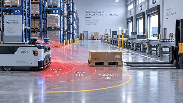
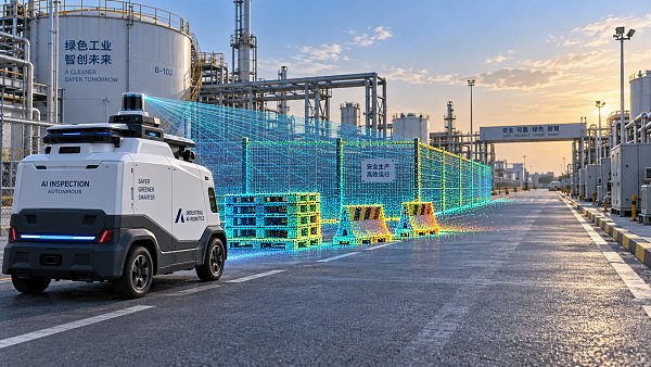
In warehouse and intralogistics operations, WMS-linked dashboards should show order release rate, pick completion, queue accumulation, AGV dispatch cycle, and exception rate. For example, if AGV mission completion drops from 96% to 89% over a 2-hour window, the screen should not only flag the decline but also correlate it with blocked intersections, charger congestion, or map localization instability.
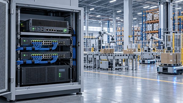
On the communication layer, OPC UA visibility is often underestimated. When server response time crosses 100 to 200 ms in a system that expects sub-100 ms exchange, operators may see delayed state changes, stale counters, or mismatched alarms. A dashboard that plots median latency, peak latency, failed sessions, and reconnection count over the last 15 minutes gives far more operational value than a generic “connected” icon.
For edge AI applications such as machine vision inspection, defect classification, or traffic control at AGV intersections, inference latency and confidence quality should be visible together. A 25 ms inference pipeline is not truly useful if confidence drops below an acceptable threshold when lighting changes, dust rises, or the camera housing heats beyond its stable operating range. Visualization should reflect both speed and reliability.
Recommended KPI groups by industrial scenario
Different industries emphasize different metrics, but the underlying logic is similar: each KPI should connect to a decision. If a number does not lead to intervention, it does not belong on the first screen.
This KPI structure supports TSV’s broader engineering approach: parameters should be specific, interpretable, and linked to process truth. If a dashboard claims intelligence but cannot quantify latency, error rate, drift, or load, it does not meet the standard required for hard-tech decision-making.
A practical threshold framework
- Real-time operator alarms: 1 to 5 second visualization cycle for active exceptions.
- Communication stability monitoring: alert when OPC UA peak latency exceeds normal baseline by 2x for more than 3 minutes.
- Edge AI control tasks: review model or hardware tuning if inference latency rises above application tolerance, often 20 to 80 ms depending on task criticality.
- AGV traffic oversight: trigger congestion review when waiting time at one junction exceeds normal window by 30% or more across repeated cycles.
How buyers and decision-makers should evaluate dashboard platforms
For procurement teams and enterprise leaders, the dashboard is not just a user interface purchase. It is a long-term data infrastructure decision. A platform selected only on appearance or license price may create hidden integration costs over the next 12 to 36 months, especially when multiple protocols, sites, and automation vendors must coexist.
The first evaluation factor is interoperability. Many facilities operate a blend of PLC brands, SCADA layers, WMS or MES software, cameras, gateways, and edge devices. A dashboard platform should support common industrial interfaces such as OPC UA, MQTT, REST APIs, and standard database connectors. Without this, every new equipment line becomes a custom project rather than a repeatable deployment.
The second factor is evidence quality. Buyers should ask whether the platform can preserve raw timestamps, device-source mapping, alarm history, and audit trails. This matters not only for operations but also for supplier qualification, maintenance review, and root-cause analysis. In regulated or high-precision sectors, the value of a dashboard often depends on whether data can be defended during technical review.
The third factor is scalability. A dashboard that works for 30 assets may fail when expanded to 300 or 3,000 data points if the architecture was designed for demonstration rather than production. Decision-makers should check user concurrency, historian strategy, edge-to-cloud traffic handling, and permission control by site, line, and role.
Buyer checklist for technical and commercial fit
The table below can be used as a practical screening tool during supplier comparison or request-for-proposal review.
A disciplined buying process should also include a pilot scope. Instead of requesting a generic demonstration, define a 2 to 6 week proof-of-value around one real workflow: AGV congestion management, machine downtime visualization, or edge AI inspection status. Then measure user adoption, alarm accuracy, and troubleshooting speed before wider rollout.
Common buying mistakes
- Choosing based on screen appearance before validating data architecture.
- Ignoring operator feedback and relying only on IT or management review.
- Comparing subscription price without estimating integration and maintenance effort.
- Approving dashboards that cannot clearly separate real-time, near-real-time, and historical layers.
These mistakes are expensive because dashboards often become the visible face of a broader automation stack. If they are weak, users blame the entire digitalization effort, even when sensors, controllers, and networks are functioning correctly underneath.
Implementation, maintenance, and adoption on the plant floor
Successful industrial IoT dashboard visualization depends as much on rollout discipline as on software capability. Many projects fail not during installation, but during the first 60 to 90 days when tags change, thresholds are poorly tuned, and users revert to spreadsheets, radio calls, or personal experience because the dashboard feels unreliable.
A practical implementation usually follows 5 stages: process mapping, data source validation, screen design by role, live threshold tuning, and user training with feedback loops. Skipping the second and fourth stages is especially risky. If tags are not validated against actual machine behavior, the dashboard may display clean but incorrect numbers. If thresholds are copied from generic templates, operators may face constant nuisance alarms or miss critical drift.
Maintenance also deserves planning. Every dashboard should have an owner, a revision cycle, and a change log. In many facilities, monthly review is sufficient for screen layout and KPI relevance, while high-change environments may need weekly threshold checks for the first 4 to 8 weeks after deployment. This is particularly true when AGV routes, SKU mix, machine recipes, or AI models change frequently.
Training must be role-specific. An operator needs to know what alarm to acknowledge and what action to take in 10 to 20 seconds. A process engineer needs drill-down logic, trend interpretation, and event correlation over longer windows. A plant manager needs summary views, shift comparison, and cross-line loss patterns. One training session for all users rarely works.
Implementation roadmap
- Stage 1: Define 8 to 12 critical KPIs tied to actions, not vanity reporting.
- Stage 2: Validate data path from sensor or system source to screen timestamp.
- Stage 3: Build separate views for operator, maintenance, engineering, and management.
- Stage 4: Tune thresholds over live operation for at least 2 production cycles or 2 weeks.
- Stage 5: Review adoption, false alarms, and response time, then expand scope gradually.
A well-maintained dashboard becomes more valuable over time because it accumulates operational context. It can reveal seasonal load variation, repeated communication failures at certain hours, or tolerance drift linked to heat buildup. That long-term visibility is essential in sectors where downtime, scrap, or delivery delay can cascade through an entire supply chain.
FAQ for operators, buyers, and technical teams
How many KPIs should appear on the main dashboard?
For most operator screens, 8 to 12 primary KPIs are a practical limit. Beyond that, scanning slows down and alarm interpretation becomes less reliable. More detailed metrics can sit one level deeper in drill-down views.
How often should industrial dashboards refresh?
It depends on the process. Active fault states may need 1 to 5 second updates, while energy summaries or shift-level utilization can refresh every 30 to 60 seconds. The critical point is that the screen should clearly show actual data age, not only visual refresh speed.
What is the most overlooked procurement criterion?
Data traceability. Many buyers compare dashboards on interface quality and license structure, but overlook timestamp integrity, source transparency, and auditability. Without these, dashboards may look convincing yet fail during troubleshooting, compliance review, or supplier qualification.
Are cloud dashboards always the best choice?
Not necessarily. Edge or hybrid deployment is often better when low latency, intermittent connectivity, or data residency concerns are important. The right architecture depends on process criticality, network quality, and how much response time variation the application can tolerate.
Industrial IoT dashboard visualization succeeds when it reflects engineering reality instead of marketing abstraction. Operators need fast, trustworthy views. Buyers need interoperable architecture and measurable value. Decision-makers need scalable visibility that supports plant performance, supplier evaluation, and digital transformation without adding information noise.
For organizations evaluating dashboard strategy across automation, edge AI, machine connectivity, or precision manufacturing workflows, the most reliable path is to start with parameters, thresholds, and user actions. If you want a clearer framework for selecting, benchmarking, or implementing industrial dashboards that people actually use, contact TechStat Vanguard to discuss your scenario, request a tailored evaluation approach, or explore more data-driven solutions.
Search News
Hot Articles
- Carbon Fiber StructuresHow to Specify Aerospace Carbon Fiber Assemblies for Lightweight, Load-Bearing PartsJul 11, 2026
- Machine VisionXiaomi, Alibaba DAMO Academy Drive Open-Source Robotics Model Ecosystem, Lowering Algorithm Development Barriers for Overseas SMEs Adopting Chinese Robotics SolutionsMar 30, 2026
- Cobots & ArmsShanxi 'AI+' Conference Showcases Embodied Intelligence with Multinational Buyer Engagement: Key Industry ImplicationsMar 30, 2026
Popular Tags
Recommended News
 Jul 11, 2026How to Specify Aerospace Carbon Fiber Assemblies for Lightweight, Load-Bearing PartsAerospace carbon fiber assemblies: learn how to specify laminate design, load data, joining methods, and inspection controls for lighter, reliable load-bearing aerospace parts.Elena Rostova (UAV Systems Researcher)
 Mar 30, 2026Xiaomi, Alibaba DAMO Academy Drive Open-Source Robotics Model Ecosystem, Lowering Algorithm Development Barriers for Overseas SMEs Adopting Chinese Robotics SolutionsXiaomi & Alibaba DAMO Academy's open-source robotics models lower algorithm barriers for global SMEs. Boost efficiency in manufacturing, logistics & smart retail with ROS 2 compatible solutions.TSV Data Lab
 Mar 30, 2026Shanxi 'AI+' Conference Showcases Embodied Intelligence with Multinational Buyer Engagement: Key Industry ImplicationsShanxi 'AI+' Conference highlights embodied intelligence with Tesla, Ubtech & Jiantao showcasing multimodal robotics. 40+ global buyers validated tech on-site, creating new B2B channels for industrial automation & AI solutions.Chen Wei (Automation Lead Engineer)
 Mar 30, 2026Zhongguancun Unveils 6G Integrated Sensing-Computing-Intelligence Platform to Empower Embodied Robots for Global Industrial ApplicationsZhongguancun's new 6G platform revolutionizes industrial robotics with <10ms latency, empowering global automotive, logistics & port automation. Discover how this tech boosts China's smart manufacturing exports.TSV Data Lab
 Mar 30, 2026Mech-Mind Tianjin Embodied Intelligence R&D and Production Base Goes Live, Cutting Delivery Time by 20%–30% for Global Customized AMR+Vision SolutionsMech-Mind's Tianjin AMR+Vision production base cuts delivery time by 20%-30% for欧美 & Latin American markets. Discover how this PLd-certified facility accelerates customized robotics solutions for smart manufacturing and logistics.Chen Wei (Automation Lead Engineer)
 Mar 30, 2026Boao Forum Reveals 'Co-evolution of Big and Small Brains' Trend in Humanoid Robots, China's Embodied Intelligence Accelerates Adaptation to Overseas Manufacturing Service ScenariosDiscover how China's humanoid robots, featuring 'Co-evolution of Big and Small Brains,' are revolutionizing global manufacturing. Learn about Embodied Tian Gong 3.0's ISO compliance and overseas deployment at Boao Forum 2026.Chen Wei (Automation Lead Engineer)
 Mar 30, 2026China Railway Industrial Secures Patent for Embodied Robotics in Material Handling, Boosting High-Precision Delivery Capabilities for Overseas Infrastructure and Manufacturing ProjectsChina Railway Industrial's new patent for embodied robotics in material handling boosts high-precision delivery for global infrastructure & manufacturing. Discover how this innovation enhances logistics accuracy in automotive, rail transit & EPC projects.Chen Wei (Automation Lead Engineer)
 Oct 13, 2026Smart Cameras vs. PC-Based Machine Vision: Which Fits High-Speed Inspection?This industrial product comparison for machine vision weighs smart cameras vs. PC-based systems on latency, throughput, and cost. Discover your best fit for high-speed inspection.TSV Data Lab
 Oct 12, 2026How to Verify RoHS Compliance in Industrial Sensing Systems Before DeploymentRoHS compliant sensing systems: learn how to verify materials, supplier declarations, testing, and configuration controls before industrial deployment.TSV Data Lab
 Oct 11, 2026How Procurement-Oriented Content Taxonomy Improves B2B Buying JourneysProcurement-oriented content taxonomy streamlines B2B buying journeys with clearer evidence, supplier comparisons, risk visibility, and faster approvals.TSV Data Lab
 Oct 10, 2026How to Select a Machine Performance Monitoring Platform for OEE and Downtime ReductionMachine performance monitoring platform selection guide: validate machine states, OEE data, downtime reasons, integrations, and scalability to reduce losses with confidence.TSV Data Lab
 Oct 08, 2026How to Machine Inconel 625 Blades Without Heat Cracks or Edge ChippingInconel 625 blade machining guide: prevent heat cracks, edge chipping, chatter, and work hardening with proven tooling, cooling, fixturing, and inspection strategies.Dr. Marcus Vance
 Oct 07, 2026How to Evaluate an HMI Panel Distributor for Industrial Automation ProjectsHMI panel distributor evaluation guide: verify technical compatibility, traceability, supply reliability, lifecycle support, and total cost for automation projects.Victor Lin (Chief Software Architect)
 Oct 06, 2026Navigation Fault Tolerance Standards for AMRs: What Safety Teams Must VerifyNavigation fault tolerance standards: learn what AMR safety teams must verify, from localization loss and sensor faults to stopping distance, safe restart, and site-specific validation.Chen Wei (Automation Lead Engineer)
 Oct 05, 2026Calculating Edge Computing Total Cost of Ownership Across Distributed SitesEdge computing ownership cost explained: calculate deployment, energy, connectivity, security, remote support, and refresh costs across distributed sites.TSV Data Lab
 Oct 04, 2026CAD/CAM Benchmarking in the GCC: What Manufacturers Should Ask a ConsultantCAD CAM benchmark consultant GCC guide: learn the key questions manufacturers should ask to validate post-processors, workflows, machine performance, and production risk.Victor Lin (Chief Software Architect)
 Oct 03, 2026Selecting Automotive Radar Sensor Modules for ADAS Range, Resolution, and IntegrationAutomotive radar sensor module selection guide for ADAS: compare range, resolution, field of view, latency, and integration to build safer, reliable vehicle systems.TSV Data Lab
 Oct 02, 2026How to Qualify Machined Parts Suppliers for Hard Tech ProgramsHard tech supply chain machined parts demand rigorous supplier qualification. Learn how to assess capability, traceability, quality controls, and delivery resilience.Dr. Marcus Vance
 Oct 01, 2026How to Select an Outdoor Security Radar Sensor for Perimeter Detection?Outdoor security radar sensor selection guide: compare range, accuracy, false-alarm control, integration, and field testing for reliable perimeter detection.TSV Data Lab
 Sep 30, 2026How to Evaluate Solid-State LiDAR Hardware for Outdoor Autonomous VehiclesSolid state LiDAR hardware evaluation guide for outdoor autonomous vehicles—compare range, point-cloud quality, environmental resilience, integration, and safety.TSV Data Lab
 Sep 29, 2026ISO 9283 Repeatability: How to Evaluate Cobot Positioning PerformanceISO 9283 cobot repeatability explained: learn how payload, reach, approach direction, and test conditions affect positioning performance and cell capability.Chen Wei (Automation Lead Engineer)
 Oct 13, 2026How to keep an industrial robotic integration project on scheduleIndustrial robotic integration project management: keep automation on schedule with proven controls for interfaces, suppliers, FAT, commissioning, and change risk.Victor Lin (Chief Software Architect)
 Oct 12, 2026What should be included in predictive maintenance pricing for factories?Predictive maintenance pricing for factories: compare sensors, software, integration, support, and total cost to secure measurable uptime gains and avoid hidden expenses.TSV Data Lab
 Oct 11, 2026How payload and reach change the cost of an industrial robotCost of industrial robot systems depends heavily on payload and reach. Learn how sizing, torque, tooling, safety, and lifecycle factors shape smarter automation investments.Chen Wei (Automation Lead Engineer)