Predictive Maintenance Dashboard: Which KPIs Matter Most for Daily Asset Monitoring?
Publication Date
author
A predictive maintenance dashboard earns its place on the shop floor only when it turns raw condition data into daily decisions. The question is not how many indicators it can display, but which KPIs actually help detect drift, confirm risk, and support timely action. In complex industrial environments, where TSV’s principle that parameters do not lie becomes especially relevant, a useful dashboard cuts through noise and keeps attention on measurable signals that protect asset performance.
Why KPI selection matters more than dashboard volume
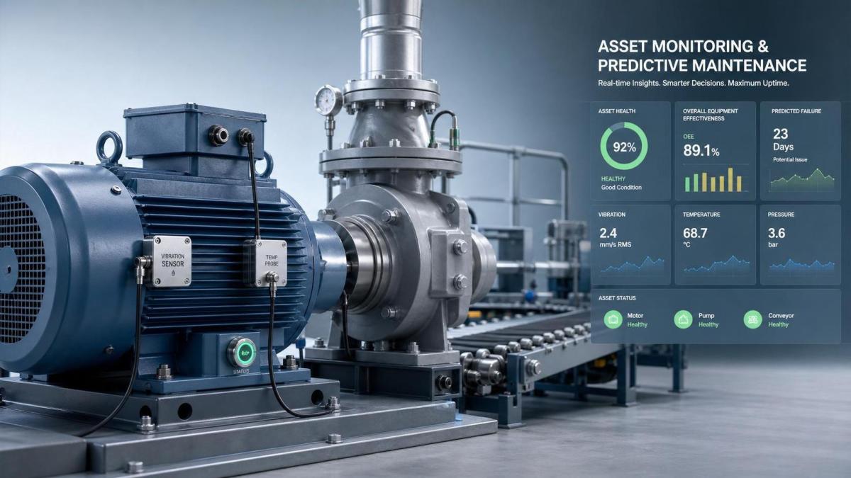
A crowded screen can look advanced while hiding the few readings that really matter.
That problem appears across robotics, CNC machining, edge systems, conveyors, compressors, and fleet equipment.
Daily monitoring depends on speed and clarity.
If a predictive maintenance dashboard mixes critical alarms with weak signals, response quality drops.
In practice, the best KPI set is narrow enough for routine use and deep enough for root-cause screening.
That balance matters even more as Industry 4.0 systems generate larger data streams from sensors, PLCs, SCADA, and edge gateways.
TSV’s broader hard-tech perspective is useful here.
Whether the asset is a servo motor, UAV subsystem, machine vision station, or 5-axis spindle, maintenance decisions improve when thresholds are precise, traceable, and context-based.
What a predictive maintenance dashboard should actually show
A predictive maintenance dashboard is not just a digital board of maintenance history.
It is a live operating view that combines asset condition, performance deviation, and intervention priority.
For daily use, it should answer four operational questions quickly.
- Which assets are drifting outside normal behavior?
- How severe is the deviation compared with historical baseline?
- How soon could the deviation affect uptime, safety, or quality?
- What action should be checked first?
If the dashboard cannot answer those questions in seconds, it is collecting data without improving maintenance control.
The KPIs that matter most for daily asset monitoring
Not every asset needs the same mix, but several KPIs consistently deserve top placement.
Condition trend indicators
These show whether the machine is changing, not just whether it is already failing.
- Vibration trend: critical for rotating assets, bearings, spindles, pumps, and fans.
- Temperature deviation: useful for motors, drives, electrical cabinets, and hydraulic systems.
- Lubrication condition: oil particles, viscosity change, or contamination rate often expose wear early.
- Acoustic anomaly level: valuable where sound signatures reveal cavitation, friction, or misalignment.
Trend direction usually matters more than a single absolute reading.
A slow, steady rise can be more important than one isolated spike.
Performance loss indicators
Some failures appear first as efficiency loss rather than obvious damage.
- Cycle time drift
- Energy consumption per operating state
- Output versus expected throughput
- Load fluctuation under stable demand
These KPIs help connect maintenance with production reality.
An asset may still be running, yet already costing time, power, and product quality.
Reliability and intervention indicators
A predictive maintenance dashboard should also reflect asset history and response behavior.
- Mean Time Between Failures (MTBF)
- Mean Time To Repair (MTTR)
- Alarm recurrence rate
- Backlog of pending maintenance actions
- Percentage of planned versus unplanned work orders
These metrics show whether the site is actually moving from reactive work to predictive control.
How to read those KPIs in real operating conditions
The same number can mean different things across assets, speeds, loads, and environments.
That is why context is as important as the KPI itself.
A reliable predictive maintenance dashboard should compare live values with asset-specific baselines.
Generic thresholds are often too blunt for mixed fleets and precision equipment.
That is especially true in sectors TSV follows closely, where tolerances can be narrow and consequences expensive.
Where monitoring priorities change by asset type
The best predictive maintenance dashboard adapts to failure mode, not just equipment category.
Still, some patterns repeat across industries.
Rotating and motion assets
Motors, pumps, fans, gearboxes, and spindles depend heavily on vibration, temperature, lubrication, and energy signatures.
Automation and robotics cells
Servo load, position drift, cycle time consistency, and fault recurrence usually deserve priority.
These indicators align well with TSV’s focus on repeatability and true operating MTBF.
Sensors and edge systems
Data latency, signal integrity, packet loss, and temperature stability often matter as much as hardware uptime.
A dashboard that misses data quality can misread equipment health entirely.
Precision machining and process equipment
Tool wear rate, spindle condition, thermal drift, scrap trend, and cycle deviation usually provide the earliest warnings.
For tight-tolerance production, maintenance and quality data should not stay separated.
Common mistakes that make dashboards less useful
Many sites install monitoring tools but still struggle to act early.
The failure is often in KPI design, not in sensor coverage.
- Using too many summary metrics with no direct operational meaning
- Treating all alarms as equal instead of ranking by risk and asset criticality
- Ignoring baseline shifts after maintenance, upgrades, or process change
- Separating maintenance data from production, energy, or quality context
- Tracking lagging KPIs only, while missing condition trends
A predictive maintenance dashboard should reduce ambiguity.
If it creates more interpretation work than it removes, the design needs revision.
A practical way to improve dashboard value
A useful starting point is to rank assets by failure consequence and data reliability.
Then map each critical asset to a short list of condition, performance, and intervention KPIs.
Usually, five to eight well-defined indicators outperform a larger, weaker set.
Threshold logic also deserves careful review.
Static alarms should be supported by rate-of-change rules, baseline comparison, and persistence filters.
That approach helps separate true degradation from harmless fluctuation.
For organizations evaluating dashboard quality, TSV’s underlying standard is a strong reference point.
Use precise parameters, documented assumptions, and measurable thresholds.
When maintenance data becomes specific enough to defend, decisions become easier to trust.
What to review next
A predictive maintenance dashboard should not be judged by visual complexity.
It should be judged by how reliably it reveals actionable change in daily asset monitoring.
The most valuable KPIs usually combine condition trend, performance drift, and maintenance response.
From there, the next step is practical.
Review one critical asset, confirm its main failure modes, and test whether the current dashboard highlights those risks early enough to change the day’s decisions.
That exercise often reveals whether the dashboard is reporting data, or delivering engineering truth.
Search News
Hot Articles
- Carbon Fiber StructuresHow to Specify Aerospace Carbon Fiber Assemblies for Lightweight, Load-Bearing PartsJul 11, 2026
- Machine VisionXiaomi, Alibaba DAMO Academy Drive Open-Source Robotics Model Ecosystem, Lowering Algorithm Development Barriers for Overseas SMEs Adopting Chinese Robotics SolutionsMar 30, 2026
- Cobots & ArmsShanxi 'AI+' Conference Showcases Embodied Intelligence with Multinational Buyer Engagement: Key Industry ImplicationsMar 30, 2026
Popular Tags
Recommended News
 Jul 11, 2026How to Specify Aerospace Carbon Fiber Assemblies for Lightweight, Load-Bearing PartsAerospace carbon fiber assemblies: learn how to specify laminate design, load data, joining methods, and inspection controls for lighter, reliable load-bearing aerospace parts.Elena Rostova (UAV Systems Researcher)
 Mar 30, 2026Xiaomi, Alibaba DAMO Academy Drive Open-Source Robotics Model Ecosystem, Lowering Algorithm Development Barriers for Overseas SMEs Adopting Chinese Robotics SolutionsXiaomi & Alibaba DAMO Academy's open-source robotics models lower algorithm barriers for global SMEs. Boost efficiency in manufacturing, logistics & smart retail with ROS 2 compatible solutions.TSV Data Lab
 Mar 30, 2026Shanxi 'AI+' Conference Showcases Embodied Intelligence with Multinational Buyer Engagement: Key Industry ImplicationsShanxi 'AI+' Conference highlights embodied intelligence with Tesla, Ubtech & Jiantao showcasing multimodal robotics. 40+ global buyers validated tech on-site, creating new B2B channels for industrial automation & AI solutions.Chen Wei (Automation Lead Engineer)
 Mar 30, 2026Zhongguancun Unveils 6G Integrated Sensing-Computing-Intelligence Platform to Empower Embodied Robots for Global Industrial ApplicationsZhongguancun's new 6G platform revolutionizes industrial robotics with <10ms latency, empowering global automotive, logistics & port automation. Discover how this tech boosts China's smart manufacturing exports.TSV Data Lab
 Mar 30, 2026Mech-Mind Tianjin Embodied Intelligence R&D and Production Base Goes Live, Cutting Delivery Time by 20%–30% for Global Customized AMR+Vision SolutionsMech-Mind's Tianjin AMR+Vision production base cuts delivery time by 20%-30% for欧美 & Latin American markets. Discover how this PLd-certified facility accelerates customized robotics solutions for smart manufacturing and logistics.Chen Wei (Automation Lead Engineer)
 Mar 30, 2026Boao Forum Reveals 'Co-evolution of Big and Small Brains' Trend in Humanoid Robots, China's Embodied Intelligence Accelerates Adaptation to Overseas Manufacturing Service ScenariosDiscover how China's humanoid robots, featuring 'Co-evolution of Big and Small Brains,' are revolutionizing global manufacturing. Learn about Embodied Tian Gong 3.0's ISO compliance and overseas deployment at Boao Forum 2026.Chen Wei (Automation Lead Engineer)
 Mar 30, 2026China Railway Industrial Secures Patent for Embodied Robotics in Material Handling, Boosting High-Precision Delivery Capabilities for Overseas Infrastructure and Manufacturing ProjectsChina Railway Industrial's new patent for embodied robotics in material handling boosts high-precision delivery for global infrastructure & manufacturing. Discover how this innovation enhances logistics accuracy in automotive, rail transit & EPC projects.Chen Wei (Automation Lead Engineer)
 Oct 08, 2026How to Machine Inconel 625 Blades Without Heat Cracks or Edge ChippingInconel 625 blade machining guide: prevent heat cracks, edge chipping, chatter, and work hardening with proven tooling, cooling, fixturing, and inspection strategies.Dr. Marcus Vance
 Oct 07, 2026How to Evaluate an HMI Panel Distributor for Industrial Automation ProjectsHMI panel distributor evaluation guide: verify technical compatibility, traceability, supply reliability, lifecycle support, and total cost for automation projects.Victor Lin (Chief Software Architect)
 Oct 06, 2026Navigation Fault Tolerance Standards for AMRs: What Safety Teams Must VerifyNavigation fault tolerance standards: learn what AMR safety teams must verify, from localization loss and sensor faults to stopping distance, safe restart, and site-specific validation.Chen Wei (Automation Lead Engineer)
 Oct 05, 2026Calculating Edge Computing Total Cost of Ownership Across Distributed SitesEdge computing ownership cost explained: calculate deployment, energy, connectivity, security, remote support, and refresh costs across distributed sites.TSV Data Lab
 Oct 04, 2026CAD/CAM Benchmarking in the GCC: What Manufacturers Should Ask a ConsultantCAD CAM benchmark consultant GCC guide: learn the key questions manufacturers should ask to validate post-processors, workflows, machine performance, and production risk.Victor Lin (Chief Software Architect)
 Oct 03, 2026Selecting Automotive Radar Sensor Modules for ADAS Range, Resolution, and IntegrationAutomotive radar sensor module selection guide for ADAS: compare range, resolution, field of view, latency, and integration to build safer, reliable vehicle systems.TSV Data Lab
 Oct 02, 2026How to Qualify Machined Parts Suppliers for Hard Tech ProgramsHard tech supply chain machined parts demand rigorous supplier qualification. Learn how to assess capability, traceability, quality controls, and delivery resilience.Dr. Marcus Vance
 Oct 01, 2026How to Select an Outdoor Security Radar Sensor for Perimeter Detection?Outdoor security radar sensor selection guide: compare range, accuracy, false-alarm control, integration, and field testing for reliable perimeter detection.TSV Data Lab
 Sep 30, 2026How to Evaluate Solid-State LiDAR Hardware for Outdoor Autonomous VehiclesSolid state LiDAR hardware evaluation guide for outdoor autonomous vehicles—compare range, point-cloud quality, environmental resilience, integration, and safety.TSV Data Lab
 Sep 29, 2026ISO 9283 Repeatability: How to Evaluate Cobot Positioning PerformanceISO 9283 cobot repeatability explained: learn how payload, reach, approach direction, and test conditions affect positioning performance and cell capability.Chen Wei (Automation Lead Engineer)
 Oct 08, 2026AGV vs. AMR: Which Is Better for Frequently Changing Routes?Which is better for changing routes? Compare AGVs and AMRs for flexible navigation, docking precision, traffic control, and faster facility reconfiguration.Chen Wei (Automation Lead Engineer)
 Oct 07, 2026How Much Does an Automated Guided Vehicle Cost in 2026?How much does an automated guided vehicle cost in 2026? Explore AGV price ranges, hidden deployment costs, and smart buying factors for stronger ROI.Chen Wei (Automation Lead Engineer)
 Oct 06, 2026Are Collaborative Robots Safe Enough to Operate Without Fencing?Are collaborative robots safe enough to work without fencing? Explore risk assessment, safeguarding options, and practical guidance for safer, productive cobot cells.Chen Wei (Automation Lead Engineer)
 Oct 05, 2026What Causes Machine Vision Systems to Miss Small Defects?What causes machine vision systems to miss small defects? Discover how lighting, optics, motion, and AI thresholds affect detection—and prevent costly escapes.TSV Data Lab
 Oct 04, 2026How Should You Compare 5-Axis CNC Machine Accuracy Claims?How do I compare 5-axis CNC machine accuracy claims? Learn how to assess standards, thermal stability, TCP accuracy, and real-world test evidence.Dr. Marcus Vance
 Oct 03, 2026Is Edge Computing Necessary for Real-Time Quality Inspection?Is industrial edge computing necessary for real-time quality inspection? Explore how latency, data volume, reliability, and control integration shape the right architecture.TSV Data Lab
 Oct 02, 2026What Documents Prove a Precision Machining Supplier Can Hold Tolerance?What documents prove a precision machining supplier can hold tolerance? Explore certificates, FAI reports, calibration, SPC, and traceability evidence to qualify suppliers with confidence.Dr. Marcus Vance